


Support
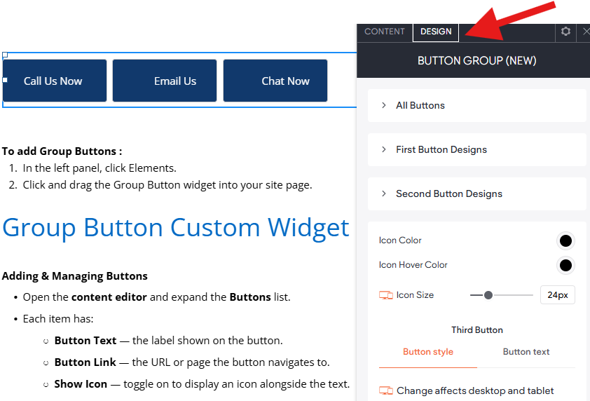
Button Group (Custom Widget)
This widget renders a fully customizable group of up to 8 buttons, each with its own label, link, optional icon, and individual design settings. It is designed to be placed anywhere on a page — hero sections, headers, footers, or inline content areas — wherever you need multiple call-to-action buttons displayed together.
To add Group Buttons :
- In the left panel, click Elements.
- Click and drag the Group Button widget into your site page.
Group Button Custom Widget Guide & Tips
Adding & Managing Buttons
- Open the content editor and expand the Buttons list.
- Each item has:
- Button Text — the label shown on the button.
- Button Link — the URL or page the button navigates to.
- Show Icon — toggle on to display an icon alongside the text.
- Button Icon — choose the icon to display when Show Icon is on.
- Use Add Item to add more buttons (up to 8).
- Drag items in the list to reorder them.
Layout & Alignment (content editor)
- Open the Button Options group.
- Button Layout — choose whether buttons sit side-by-side (Stack Buttons to Side) or stack vertically (Stack Buttons to Bottom).
- Align Buttons — align the group to the Left, Center, or Right of its container.
- Button Spacing — controls the gap between buttons.
- All three settings are independent for Desktop/Tablet and Mobile. Switch your editor device view to configure each breakpoint.
Styling Buttons (Design Tab)
- All Buttons group — controls that apply to every button at once:
- Content Alignment — aligns the icon and text inside each button.
- Top & Bottom Padding and Left & Right Padding — inner spacing.
- First Button Designs through Eighth Button Designs — per-button overrides:
- Icon Colour — fill colour of the SVG icon at rest.
- Icon Hover Colour — fill colour when the user hovers over the button.
- Icon Size — width and height of the icon container.
- Button Style — full button styling (background, border, text, hover state, dimensions).
Editor Theme Settings
Any changes you make within the design editor will override styles set at the theme button level. If you need to revert back to the theme button style, click Reset to theme style
Troubleshooting Tips:
Buttons are not showing
- Make sure at least one item exists in the Buttons list in the content editor and that it has Button Text filled in.
Icon is not visible
- Check that Show Icon is toggled on for that button item.
- Make sure a Button Icon has been selected for that item.
Icon color is not changing
- Icon colour is set per button in the design panel under the matching numbered group (e.g. Second Button Designs for the second button).
- If the icon SVG does not use
<path>elements, the fill rule may not apply — try a different icon from the icon picker.
Layout looks wrong on mobile
- Switch the editor device view to Mobile and re-check the Button Layout, Align Buttons, and Button Spacing settings inside Button Options — they are saved separately per device.
Spacing between buttons is uneven
- The spacing value is split evenly as a margin on each side of every button. If a button appears to have double spacing, check that you haven't also set padding on the button style in the design panel.
Only some design changes apply
- Each numbered design group (First, Second … Eighth) only controls the button at that position in the list. If you reorder buttons in the content editor, their design settings stay tied to their position number, not to the button label.