Support
Troubleshooting Flex (1.0)
Limitations
The following information is relevant for Flex sections and Flex Mode:
- Objects cannot be dragged from one grid to another within the editor
- Note
- Objects can be moved from one grid to another using the Layers panel.
- Flexboxes cannot be connected to collections
- Flex sections cannot be added to the header
故障排除常见问题解答
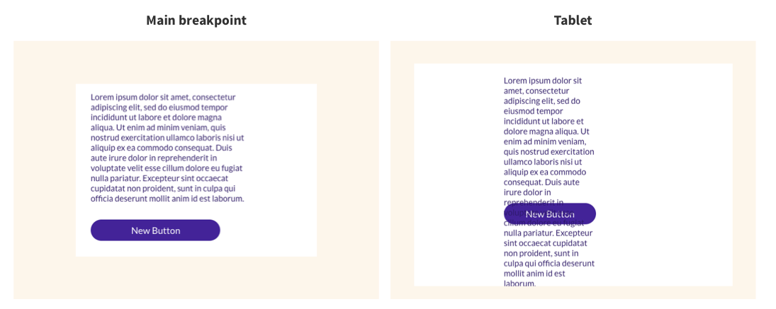
My text is overlapping objects below when I switch to tablet/mobile breakpoints

This may occur when items are placed directly on the grid or the container layout is 1x1.
在顶部导航中,单击桌面断点。
- If the overlapping objects are in a container, in the Design panel, under Custom Layout, select additional rows from the drop-down, and place each object in a row.
- If the items are directly on the grid, add a container with rows and drag the objects to it as specified above. Alternatively, you can plan objects in a vertical flexbox.
I can’t drag to resize my grid on mobile
Grid height is set as a minimum value, meaning it won’t get smaller than what you set. For example, if the grid minimum height is set to 400px minimum height with a container set to 1200 px minimum height, the grid can’t be less than 1200px.
To resize the content:
In the Design panel, under Size, reconfigure the minimum height. Alternatively, resize the content inline and then resize the grid inline or using the Design panel.
My row expanded and is very large on mobile
Flex transforms grid columns to rows on mobile. If the minimum height of an object (for example, a container) is larger than the minimum height of the grid on the main breakpoint, the row on mobile may not display correctly.
Since the grid is resized based on its content, it means most commonly, there is an image or container that is set in px.
To resize the content:
From the main breakpoint, in the Design panel, under Size, reconfigure the minimum height. Alternatively, resize the content inline and then resize the grid inline or using the Design panel.
当我切换断点时,我的设计看起来很混乱
The following reasons may explain why your design looks messy when you switch breakpoints:
- Objects are not snapped to grid lines. This is more common when the cells are small.
- Objects in the grid are not aligned.
- The pin is in a default state. Each time you add a new object, the object is pinned to the top left, by default. When you align it, you change pinning. For example, align bottom will pin to the bottom. Note that drag the object after pinning is resetting back to the default state.
To snap objects to grid lines, drag and object and use the pink snap lines in order to place objects on the grid. Alternatively, use the alignment controllers from the Design panel.
To manually set the pin, select an object, and in the Design panel scroll to Position. Next to Pin, click the arrow corresponding to where you want to pin the object.
I can’t change the font size on tablet
桌面(主断点和宽桌面)和平板电脑的字体大小相同。我们建议您尝试使用适合桌面和平板电脑的字体大小。
I try to rearrange elements on mobile specifically but it keeps affecting all the breakpoints
结构的更改会影响所有断点。例如,在主断点上,如果有 2 个相邻的容器横跨整个网格,但您希望这些元素在移动设备上垂直堆叠。当您尝试更改位置时,它们会被嵌套。当您在移动设备上嵌套元素时,它将影响所有断点,并会嵌套在所有断点上。没有空间移动这些元素以垂直堆叠,因此它们会被嵌套。
To fix this, change the minimum height on the space you are working on. Select the Grid, and in the Design panel, under Size, increase the Min Height. This allows you to have more space to move elements around. After you rearrange the elements, you can resize it to the desired height.
Note
Location change in mobile portrait only affect mobile landscape.

Customer Support Hours
Mon - Fri, 9 am to 9 pm (CT)
Sat, 9 am to 6 pm (CT)
(Chat Unavailable on Saturdays)
iClassPro offices will be closed in observance of the following holidays:
New Year's 2024 (Jan 1, 2024), Good Friday (March 29, 2024), Memorial Day (May 27, 2024), Independence Day (Jul 4, 2024) Labor Day (Sep 2, 2024), Thanksgiving (Nov 28 - 29, 2024), Christmas (Dec 24 - 25, 2024)
Visit the Customer Support Page


